


Brand Identity | Editorial Art Direction + Design | Print Production
Free Society is a new quarterly magazine for The Cato Institute, a renowned political think tank. I worked alongside the team at Long Dash to create this publication from scratch. The full scope of the work encompassed naming, stakeholder interviews, strategy, brand identity, art direction and design, ultimately creating a magazine playbook with guidelines so they could take the publication in-house.
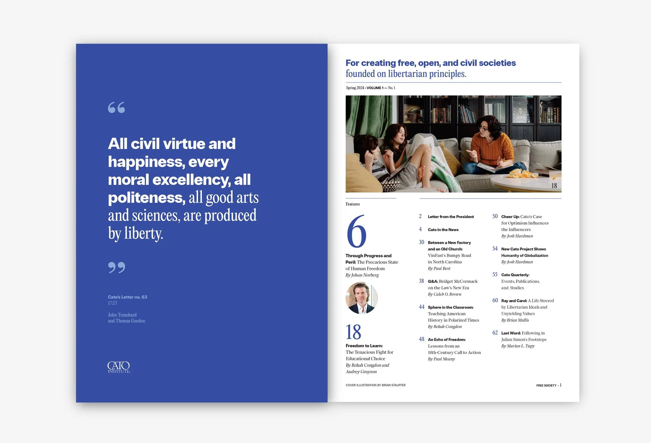
The vision for the magazine was established through a set of creative tools: the word mark, typography, color palette, photo direction, illustration direction, as well as a logic for creating layouts.
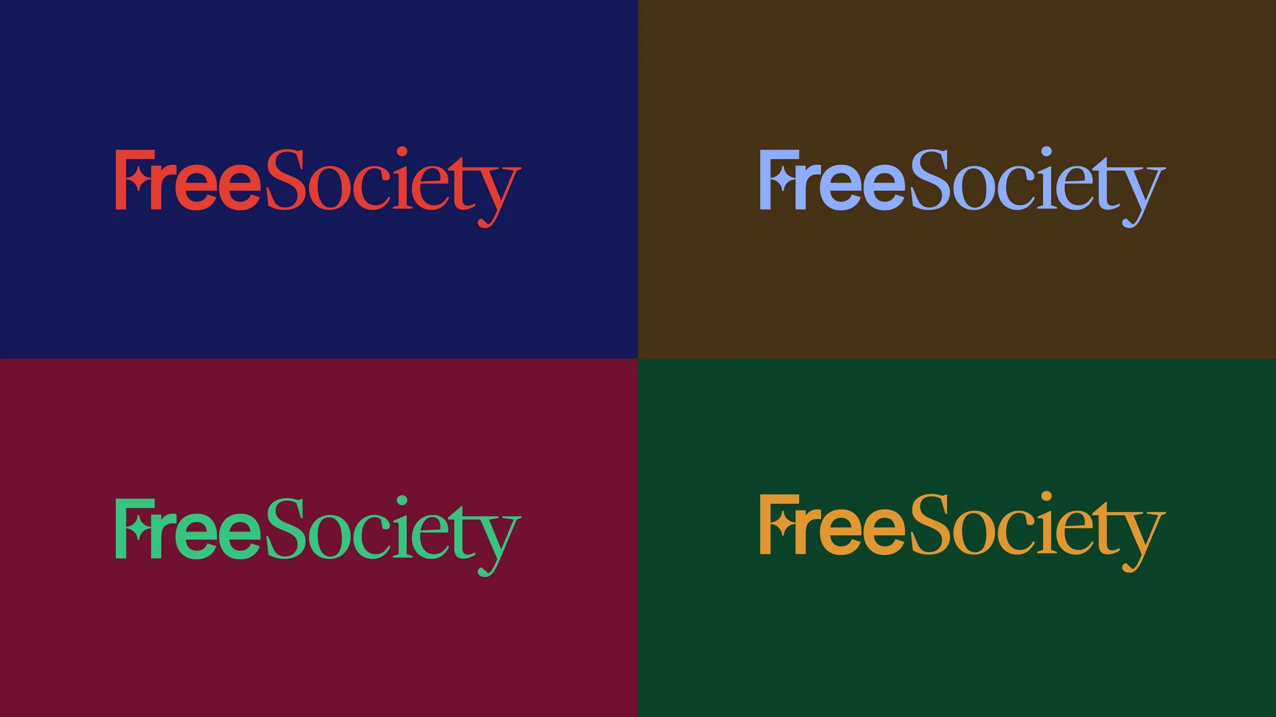
The word mark mixes two different type styles to capture the balance between tradition and modernity, creating a dialogue between the two. The star contained within the “F” represents the American tradition of freedom, and it’s also incorporated in the alphabet of drop caps.
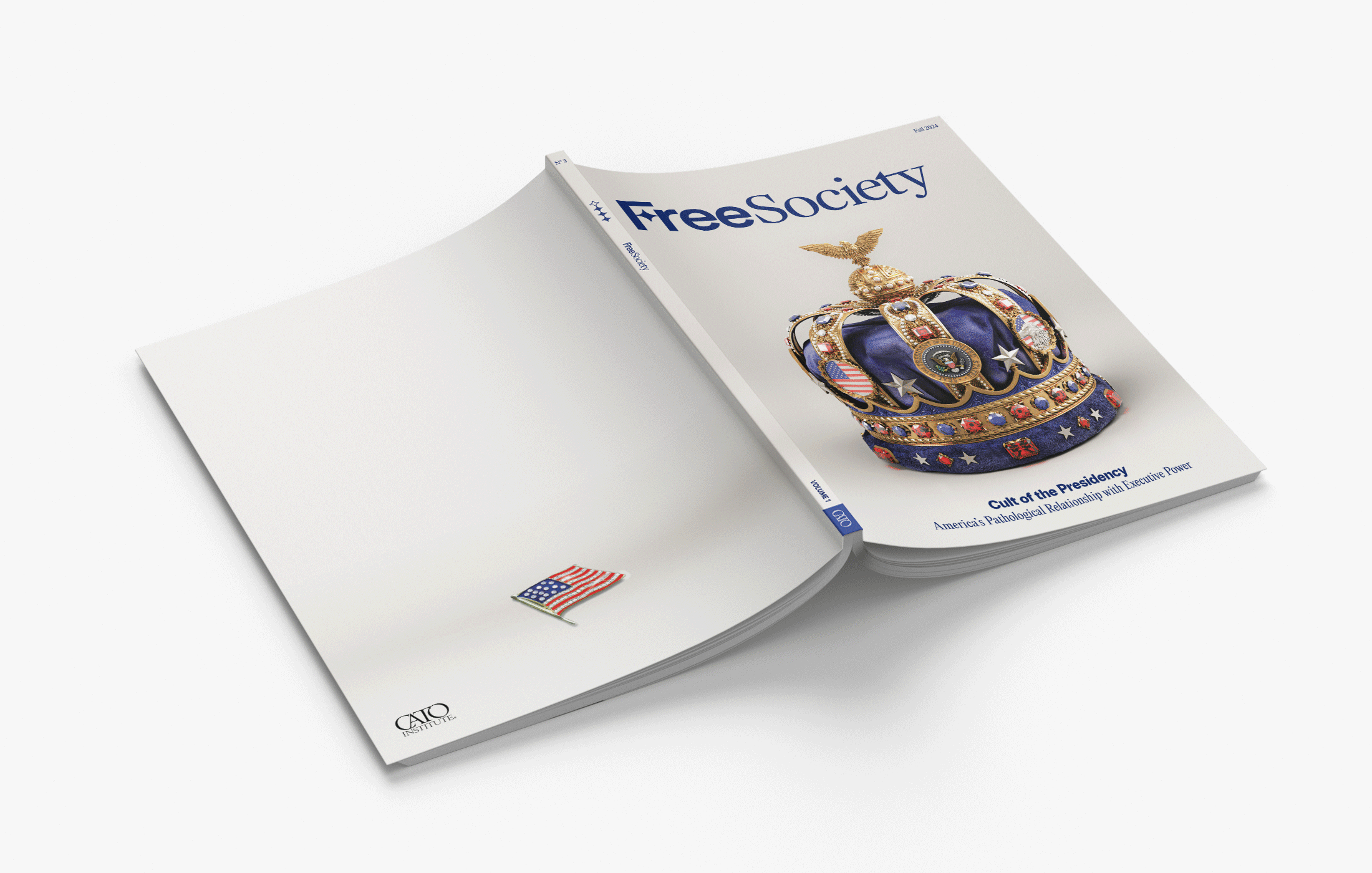
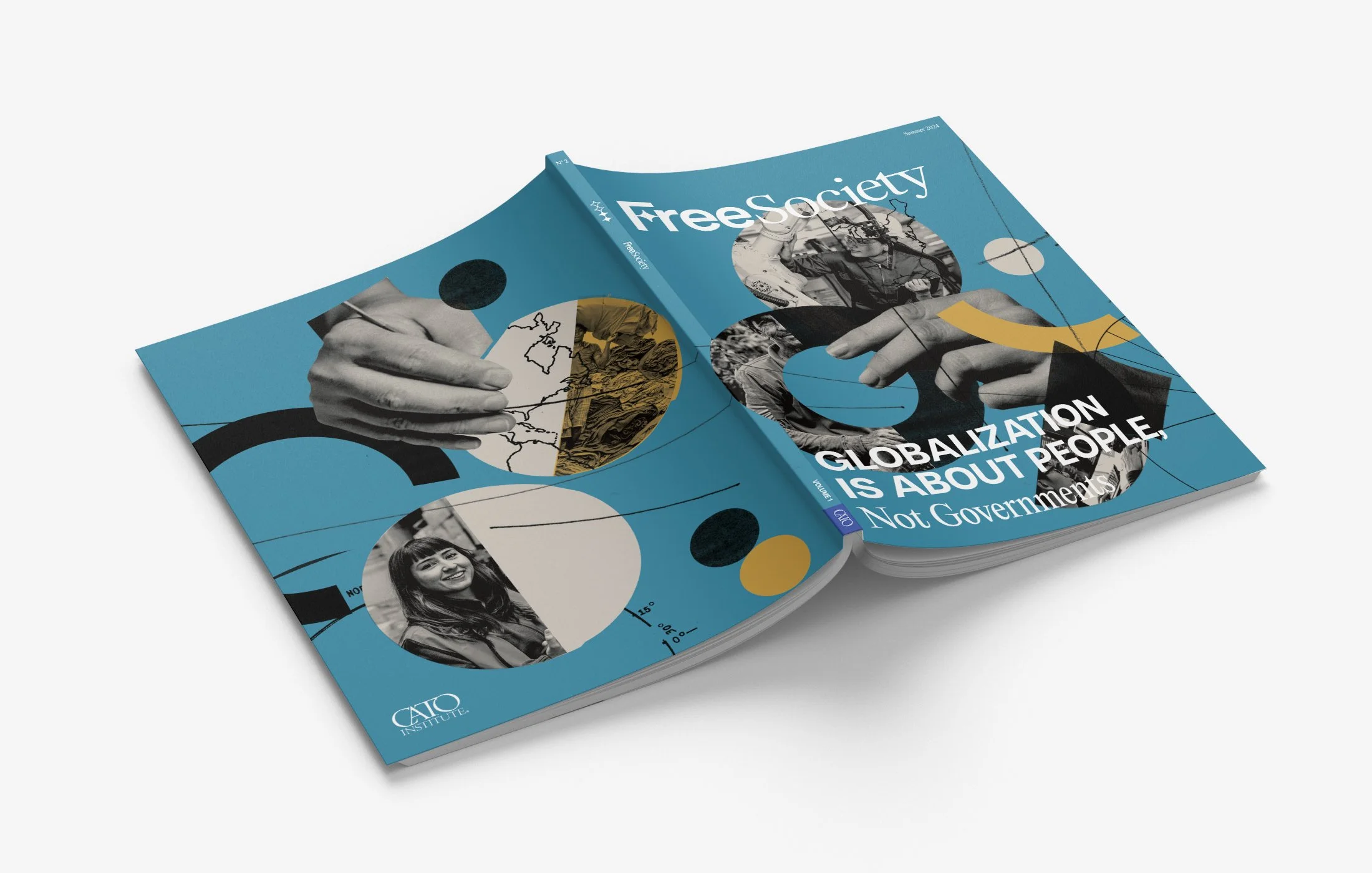
After the brand identity was in place, the art direction and design of the magazine followed, with front-of-book content, two feature articles, several non-feature pieces, and back-of-book content.
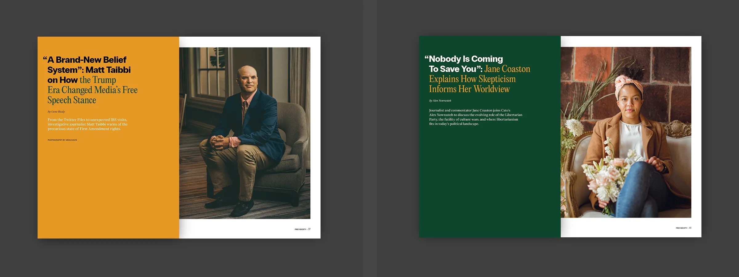
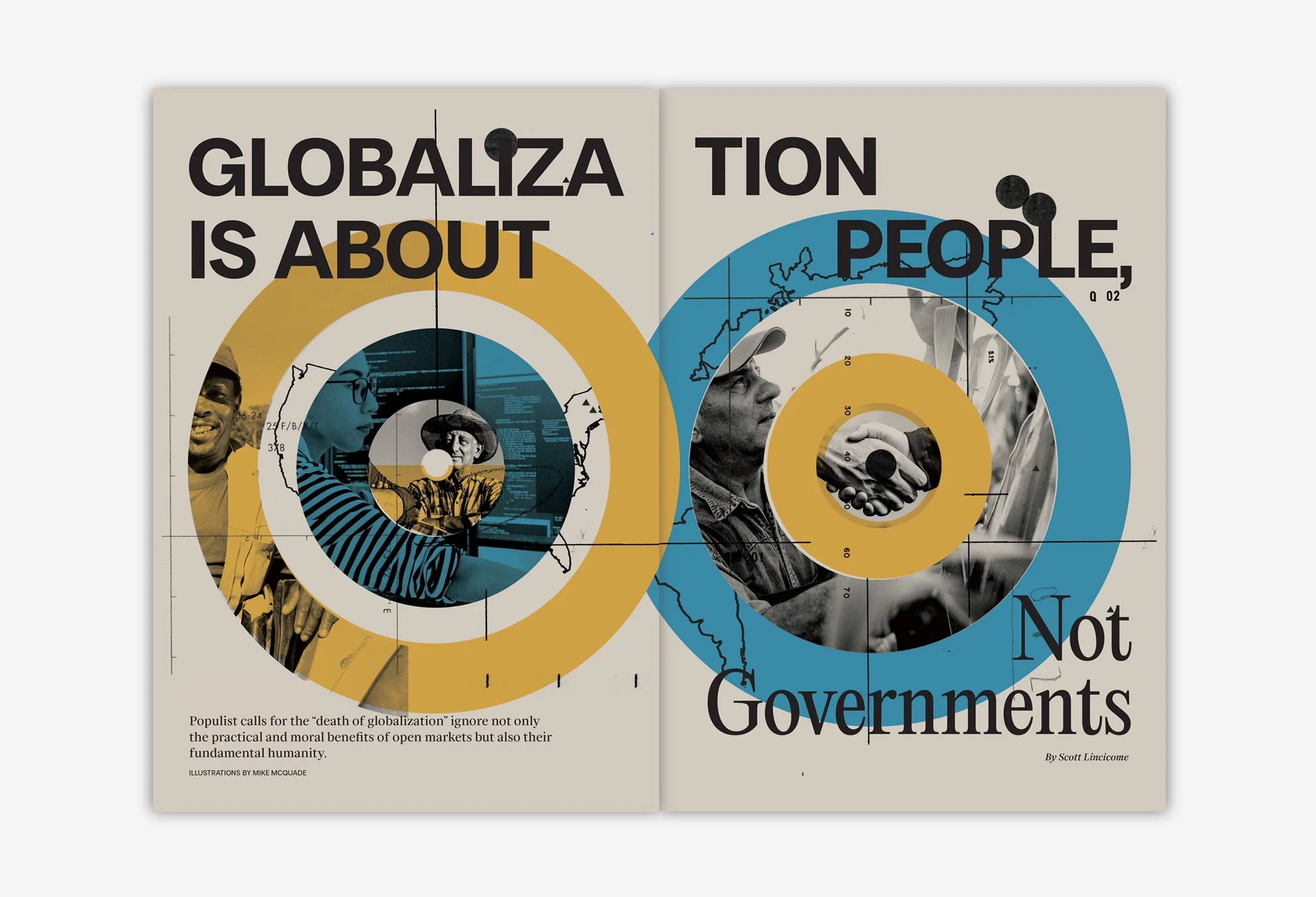
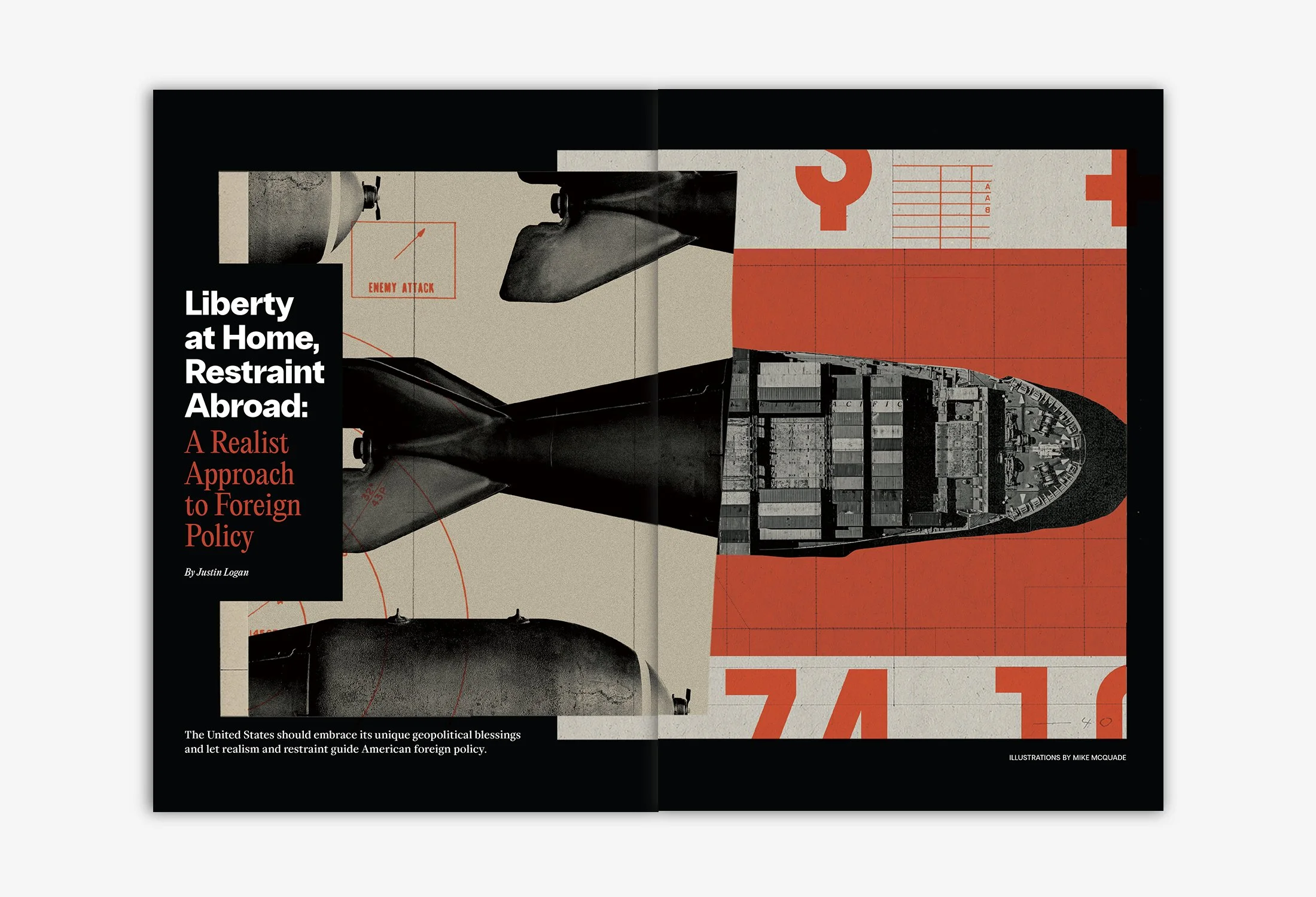
We wanted the photo direction to follow an editorially compelling journalistic approach. For illustration directions, landed on three types of overarching styles to follow: bold/graphic, expressive collage, and provocative photo illustration.
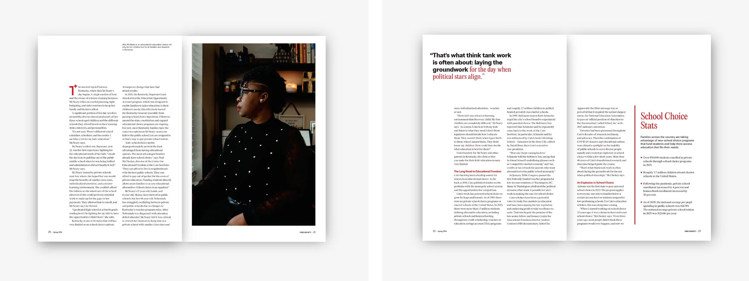
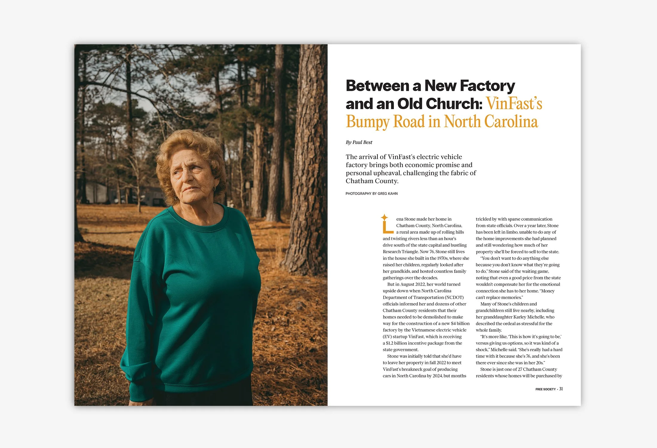
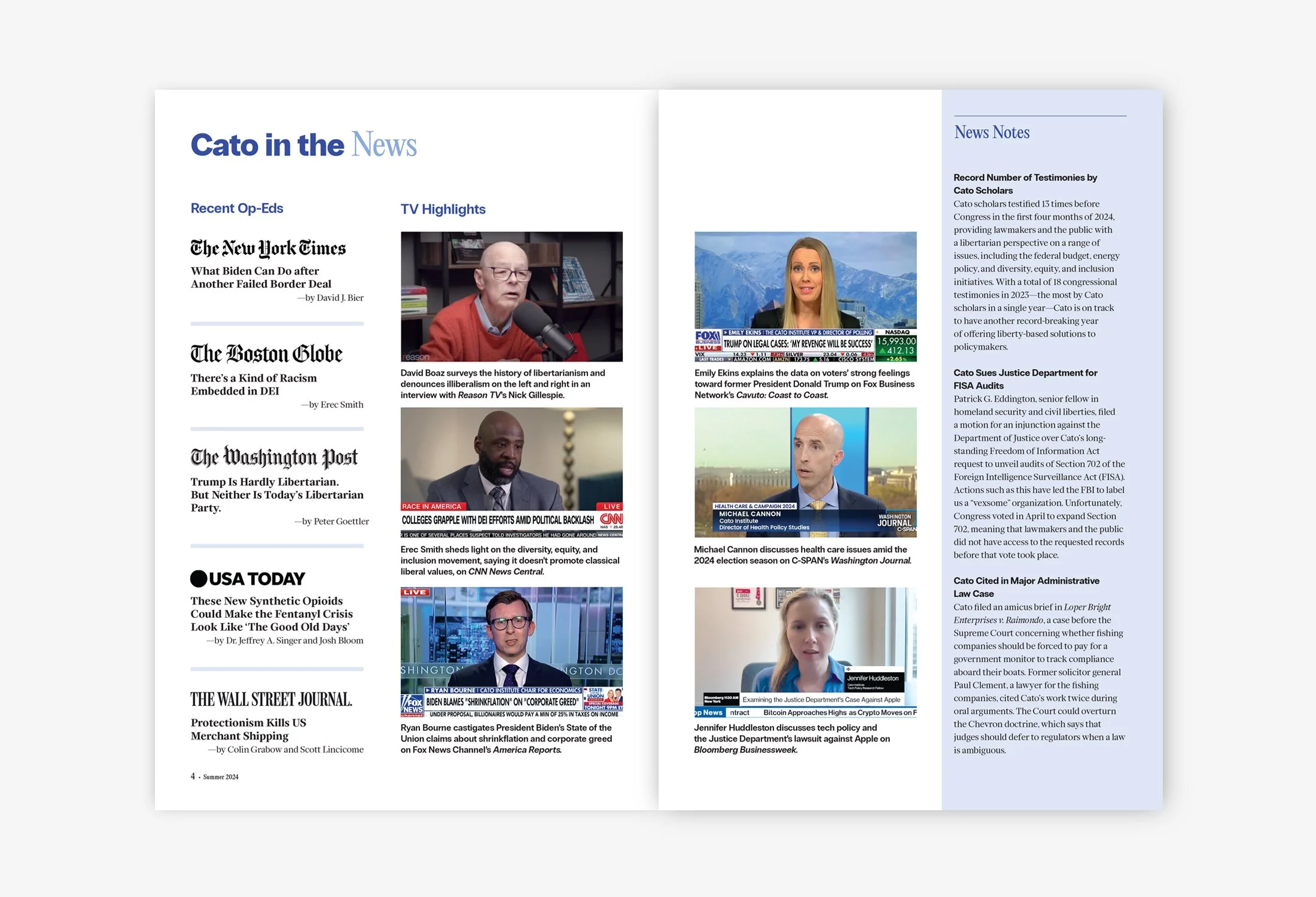
The flexible, grid-based layout allowed for plenty of negative space, aligning with the client’s direction to keep pages open and inviting. The overall approach for feature and non-feature articles was to balance visual interest with legibility to create an engaging editorial experience. For the features, each article opens with a full-page spread, showcasing either photography or illustration paired with expressive typographic treatments. For the non-feature articles, the opening spreads make use of large color blocks, full-page photos, or illustrations to help pace the flow of the publication.
Role
Art Director, Brand + Editorial
Design, Brand + Editorial
Print Production
Agency
Long Dash
Full Team
Jaymes Moore, Creative Director
Elisa Bates, Art Director, Designer, Print Production
Meghan Dusaniwskyj, Client Services
Gabriel Muller, Strategy + Editorial